Typeface
|
|
In typography, a typeface is a co-ordinated set of character designs, which usually comprises an alphabet of letters, a set of numerals and a set of punctuation marks. There are also typefaces of Ideograms and symbols (e.g. mathematical or map making).
In its widest sense a typeface could be said to be a set of design rules (i.e. a style, look or feel) in which any character can be conceived. This allows for addition of new characters to existing typefaces (e.g. the introduction of the euro sign).
The art of designing typefaces is called type design, being the occupation of a type designer.
| Contents |
Introduction
A font (from Middle French fonte, meaning "(something that has been) melt(ed)", as metal letters of a typeface were cast at a type foundry) is a set of glyphs (images) representing the characters from a particular character set in a particular typeface. Traditionally a font was specific to a given size (the actual height of characters), weight (how dark the text appears e.g. bold, light) and style (most commonly regular, italic or condensed). The design of a given character in font took into account all these three factors. Photographic typesetting allowed for optical scaling which meant that multiple sizes could be produced from a single font (although physical constraints on the reproduction system being used still require design changes at different sizes e.g. ink traps and spikes to allow for spread of ink).
In digital fonts, the image of each character may be encoded either as a bitmap (in a bitmap font) or by a higher-level description in terms of lines and curves enclosing space (an outline font, also called "vector font").
The term fount has been used for centuries to refer to the contemporary technological device used to print in a particular size and typeface. Virtually all founts were cast by type foundries in various lead alloys from the 1450s until the middle of the 20th century. A few large founts were made of wood, especially in the USA. This is known as wood type. There was a relatively brief overlapping period (ca. 1950s–1990s) where photographic technology, known as phototypesetting, was used; founts came on rolls or discs of film. From the mid-1980s the move to digital typography has been relentless and the American spelling font has been almost universally adopted. The term font nowadays almost always refers to a computer file containing scalable, outline letterforms, usually in one of several common formats. Some fonts, such as Microsoft's Verdana, are intended primarily for use on computer screens.
Typeface characterisation
Typographers have derived a comprehensive vocabulary for describing and discussing the appearances of typefaces. Some vocabulary is only applicable to a subset of all scripts.
Serifs
| Missing image Serif_and_sans-serif_01.png Image:Serif and sans-serif 01.png |
Sans-serif font |
| Missing image Serif_and_sans-serif_02.png Image:Serif and sans-serif 02.png |
Serif font |
| Missing image Serif_and_sans-serif_03.png Image:Serif and sans-serif 03.png |
Serif font (serifs highlighted in red) |
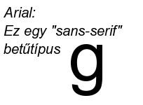
Fonts can be divided in the categories of serif and sans-serif fonts. Serifs are the small features at the end of strokes within letters. A typeface without serifs is called sans-serif (from French sans: "without"), also referred to as grotesque (or, in German, grotesk). See serif for etymological notes.
There is great variety among both serif and sans-serif fonts; both groups contain faces designed for setting large amounts of body text, and others intended primarily as decorative. The presence or absence of serifs is only one of many factors to consider when choosing a font.
Typefaces with serifs are often considered easier to read in long passages than those without. Studies on the matter are ambiguous, suggesting that most of this effect is due to the greater familiarity of serif typefaces. As a general rule, printed works such as newspapers and books almost always use serif fonts, at least for the text body. Web sites do not have to specify a font and can simply respect the browser settings of the user. But of those websites that do specify a font, most use modern sans-serif fonts such as Verdana, because it is commonly believed that, in contrast to the case for printed material, sans-serif fonts are easier than serif fonts to read on computer screens due to their lower resolution.
Proportionality
Proportional-vs-monospace.png
Proportional vs. monospace fonts
A font whose glyphs are displayed using varying widths is a proportional font while one with fixed width is a non-proportional (or monospace or fixed-width) font.
Proportional fonts are generally considered nicer-looking and easier to read and are thus more commonly used type of font in professionally published printed material. For the same reason, they are typically used in GUI computer applications, such as word processors and web browsers. However, many proportional fonts contain fixed-width figures so that columns of numbers are aligned.
Non-proportional fonts are considered better than proportional fonts for some purposes because their characters line up in nice, neat columns. Most non-electronic typewriters and text-only computer displays use only non-proportional fonts. Most computer programs which have a text-based interface, such as terminal emulators, are configured to use only non-proportional fonts. Most computer programmers prefer to use monospace fonts.
ASCII art requires a non-proportional font for proper viewing. In a web page, non-proportional fonts are most commonly encountered as a result of the <pre> </pre> HTML tag. In LaTeX, non-proportional fonts are used by the verbatim environment.
The two lines of text in non-proportional font (should) display as equal width, while the two lines in proportional font are radically different widths. This is because wide characters' glyphs (WQZMDOHU) get more screen width and narrow characters' glyphs (itl[]1|I) get less when using a proportional font.
Editors read manuscripts in fixed-width fonts. They are easier to edit and it is considered discourteous to submit a manuscript in a proportional font.
Measurements
Vertical_typographic_terms.png
The characters "Aghfy", set in Palatino to illustrate the concepts of baseline, x-height, body size, descent and ascent.
Typographic_ascenders.png
An ascender rises above the height of regular lowercase characters.
Typographic_descenders.png
A descender descends below the baseline.
Font families
Since a plethora of typefaces has been created over the centuries, they are commonly categorized into families according to their appearance. Interestingly, this categorization corresponds vaguely with the historic evolution of typefaces.
At the highest level, one can differentiate between blackletter, serif, sans-serif, and decorational fonts.
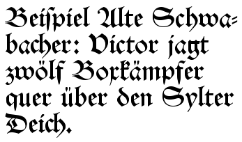
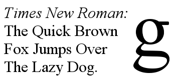
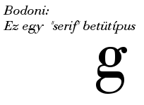
Note: The following font samples print a sentence of patent nonsense, whose only purpose is to contain all letters of the alphabet (pangram).
Blackletter typefaces
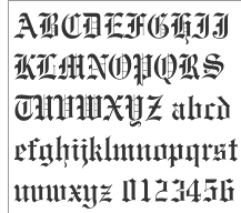
Blackletter fonts were the earliest fonts used with the invention of the printing press. They resemble the blackletter calligraphy of that time. They are often called gothic script.
|
|
|
Missing image Fraktur_walbaum.png Fraktur lettering
|
Serif fonts
Serif fonts, sometimes called roman, are in turn divided into four major groups:
- Renaissance or Garalde Oldstyle, with only slight differences in thickness within each glyph; this category includes the Garamond and Palatino typefaces.
- Baroque or Transitional, where the thickness within each glyph has greater variety; this category includes Baskerville and Times Roman.
- Classicist, Didone, or Modern, with the most variance of thickness within each glyph. These are fonts designed after, and strongly influenced by, the introduction of finer typecasting techniques in the mid-1700s. This family includes the Bodoni and Century Schoolbook typefaces.
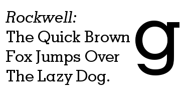
- Contemporary fonts, especially those designed primarily for decorative purposes, frequently fall outside any of these categories. For example, slab serif fonts such as Rockwell look artificial on purpose, with almost rectangular shapes.
Sans-serif fonts
Sans-serif designs are a relatively recent typographical phenomenon in the history of type design. The first specimen appears to be the two-line English so-called "Egyptian" font released in 1816 by William Caslon's foundry, England. They are commonly, but not exclusively, used for display typography applications such as signage, headings, and other situations where clear meaning is imperative but continuous reading is not required; an exception is the text on web pages that is mostly in sans-serif font because serifs make small letters less readable on a computer monitor.
Sans serif designs are broadly divided into 4 major groups for the purposes of type classification:
- Grotesques, early sans serif designs, such as Grotesque or Royal Gothic.
Frutiger.png
- Humanist (Edward Johnston's Railway type, Gill Sans or Frutiger).
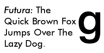
- Geometric (Futura or Spartan).
Other commonly used sans-serif fonts include Optima, Tahoma and Verdana.
Note that in some sans-serif fonts I (capital-i) and l (lowercase-L) are exactly the same! (Arial: Il) At least in Verdana they are different: Il due to the fact that Verdana's capital-i, as an exception, has serifs.
Monochrome or with shades of grey
Digital bitmap fonts (and the final rendering of vector fonts) may be monochrome or with shades of gray. The latter is for the purpose of anti-aliasing and is not suitable for use in images with a transparent background, except when partial transparency is applied. Note that there is no theoretical difference between a low-resolution grayscale bitmap and a high-resolution monochrome bitmap resampled at the same low resolution.
Texts used to demonstrate typefaces
To demonstrate typefaces, a pangram, such as "the quick brown fox jumps over a lazy dog," is often used. In English typefaces, one passage commonly used since the 16th century is lorem ipsum which originated as a Latin passage from Cicero.
Legal aspects of typefaces
In the United States, typeface designs are not copyrightable, although unusually novel designs may be patentable. Digital fonts that embody a particular design are often copyrightable as computer programs. The names of the typefaces can be trademarked. The result of these various means of legal protection is that sometimes the same typeface exists in multiple names and implementations.
Some elements of the software engines used to display typefaces on computers have software patents associated with them. In particular, Apple Computer has patented some of the hinting algorithms for TrueType, requiring open source alternatives such as FreeType to use different algorithms.
Related articles
- Calligraphy
- Dingbat
- Emphasis (typography)
- Font family (HTML)
- List of typefaces
- List of typographic features
- Typography
- Typographic units
External links
- CSS Font properties? (http://www.hscripts.com/tutorials/css/fontp.php), Font style, weight, size and family.
- What the Font? (http://www.myfonts.com/WhatTheFont), It can identify the font used from an image.
- SachNet (http://www.sachnet.tk), A program that can let you install fonts with a click of a button. (appears to be down)
- SearchFreeFonts.com (http://www.searchfreefonts.com/), Nice archive of free fonts in different categories.
- NeedFonts.com (http://www.needfonts.com), a free font resource for PC's and Macs
- FontForge (http://fontforge.sourceforge.net), a very powerful (and free) font editor
- Typeface Terminology (http://members.aol.com/willadams/portfolio/typography/typefaceterminology.pdf), a glossary by William Adams
- One Typeface, Many Fonts (http://members.aol.com/willadams/portfolio/typography/onetype.pdf), by William Adams
- Guide to making fonts (http://www.chank.com/howto/index.php)
- Typo.cz (http://euro.typo.cz/) Information on Central European typography and typesetting
- Diacritics Project (http://diacritics.typo.cz) — All you need to design a font with correct accents
- Directory of free fonts website (http://welovefreebies.com/folders/Free_Fonts)da:Skrifttype
de:Schriftart fr:Fonte de caractères ko:글꼴 hu:Betűkép nl:Lettertype ja:書体 ru:Шрифт sv:Teckensnitt zh:字型

