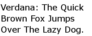
Verdana
|
|
Verdana is a sans-serif typeface designed by Matthew Carter for Microsoft Corporation, with hand-hinting done by Agfa Monotype’s Tom Rickner.
Released in 1996, Verdana was bundled with subsequent versions of Microsoft's Windows operating system, as well as their Office and Internet Explorer software on both Windows and Mac OS. In addition, it was long available for download from Microsoft's web site allowing it to be used by any system supporting Truetype fonts. As a result, it is now installed on most desktop computers. The redistributable downloadable file is still available from a third-party web site; see the External links section.
Bearing similarities to humanist sans-serif typefaces such as Frutiger, Verdana has been designed with the computer screen use in mind, to be readable at small sizes. The lack of serifs, large x-height, wide proportions, loose letter-spacing, large counters, and emphasized distinctions between similarly-shaped characters are considered to increase its readability. As a result, it is often chosen by web designers attempting to cram large amounts of text into a small space.
The Tahoma typeface is similar to Verdana but with tighter letter-spacing; other similar faces include Frutiger and Bitstream Vera Sans.
| Contents |
Criticism of using Verdana on the web
Some have suggested that web authors should not specify the use of Verdana on a web page [1] (http://www.xs4all.nl/~sbpoley/webmatters/verdana.html)[2] (http://virtuelvis.com/archives/2004/01/avoid-verdana). They argue that while Verdana is readable at small font sizes due to its high x-height, some other typefaces like Times New Roman are hard to read at the same point size. The effect is to reduce readability for those people reading the page on computers where Verdana or similar fonts like Bitstream Vera Sans are not installed or if users override the site's font with significantly different fonts, especially serif ones. CSS 2 included properties (such as font-size-adjust) that would have allowed web designers to guide user agents in choosing appropriate replacement fonts, but these have yet to be implemented in any production browser, and have therefore been removed from the CSS 2.1 candidate recommendation.
Combining characters bug
Verdana (v. 2.43) uses a nonstandard position for combining diacritical marks, causing them to display on the following character instead of the preceding. This makes it unsuitable for Unicode-encoded text such as Cyrillic or Greek. If Verdana is installed, diacritics below are displayed over the letter e, whereas they should have appeared over the letter a. This bug does not usually reveal itself with Latin letters. This is because some font display engines substitute sequences of base character + combining character with a precomposed character glyph.
In Verdana: (assuming you have it installed)
а̀е а́е а̃е а̉е | ὰε άε α̃ε α̉ε | àe áe ãe ảe
In your browser's current font:
а̀е а́е а̃е а̉е | ὰε άε α̃ε α̉ε | àe áe ãe ảe
(The first column is Cyrillic, the second column is Greek, and the third column is Latin)
See also
External links
- Information about Verdana from Microsoft (http://www.microsoft.com/typography/fonts/font.aspx?FID=1&FNAME=Verdana)
- Downloadable version of Verdana (http://prdownloads.sourceforge.net/corefonts/verdan32.exe?download) (from the Web core fonts)

