Bodoni
|
|
Bodoni is a typeface designed by Giambattista Bodoni (February 16, 1740 in Saluzzo – November 29, 1813 in Parma), an Italian engraver, publisher, printer and typographer of high repute. Bodoni was appointed printer to the court of Parma in 1768. The Bodoni Museum, named for the artisan, was opened in Parma in 1963.
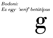
Giambattista Bodoni achieved an unprecedented level of technical refinement, allowing him to faithfully reproduce letterforms with very thin "hairlines", standing in sharp contrast to the thicker lines constituting the main stems of the characters. His printing reflected an aesthetic of plain, unadorned style, combined with purity of materials. This style attracted many admirers and imitators, surpassing the popularity of French typographers such as Philippe Grandjean and Pierre Simon Fournier.
The serifs of Bodoni, in addition to being very thin, are also nearly perpendicular to the main stem, as opposed to the gently sloping serifs of the so-called "oldstyle" typefaces. In addition, the emphasis of stress is very nearly vertical. The result is an overall clean, yet somewhat cold, appearance, both loved and hated by typographers.
Bodoni's original designs are periodically revived by new font designers. Indeed, during the age of metal type, every serious foundry had its own adaptation of Bodoni. Thus, today there is not a single typeface design called "Bodoni", but a range of adaptations, each with its own distinctive flavour.
Some adaptions, such as Bauer Bodoni, emphasize the extreme contrast between hairline and main stroke, which can be made considerably more pronounced using modern techniques of typography and printing than even the most skilled work of the 18th century. In text sizes, such hairlines almost disappear visually, resulting in reduced legibility.
Other designs, such as the ATF Bodoni designed by Morris Fuller Benton, capture the flavor of Bodoni's printing, emphasizing legibility rather than trying to push against the limits of printing technology.
Bodoni typefaces can sometimes suffer from a particular kind of legibility degradation known as "dazzle" caused by the thick vertical lines.
Bodoni forms the basis of a number of corporate identities, notably IBM.
Most current digital font systems generate different sizes of type from a single design using mathematically precise scaling, while printers working with metal type invariably adjusted the designs subtly for different sizes, for example opening up counters and expanding the width in small sizes. Typefaces of the Bodoni family tend to stress this difference. Many digital revivals are based on designs adjusted for large sizes, making the already thin hairlines even thinner. Some digital typographers are rediscovering the older lore of "optical scaling", and we can look forward to new revivals designed more to please the eye than to satisfy mathematical principles.
Sample
The following paragraph is in some version of Bodoni, if at least one of them is installed on your machine. If not, a monospace font is used:
Lorem ipsum dolor sit amet, consectetur adipisicing elit, sed do eiusmod tempor incididunt ut labore et dolore magna aliqua. Ut enim ad minim veniam, quis nostrud exercitation ullamco laboris nisi ut aliquip ex ea commodo consequat. Duis aute irure dolor in reprehenderit in voluptate velit esse cillum dolore eu fugiat nulla pariatur. Excepteur sint occaecat cupidatat non proident, sunt in culpa qui officia deserunt mollit anim id est laborum. The quick brown fox jumps over a lazy dog. 这是一些汉字。 Zhè shì yì xiē Hànzì. Example of IPA transcription: /ɪg'zɑːmpəl əv aɪpiː'eɪ tɹɑːn'skɹɪpʃən/. Greek: Ελληνικά. Cyrillic: Кириллица. Thai: ฟหกดึ้. Khmer: កខ. Arabic: العربية. Scandinavian characters: ÅÄÆÖØ åäæöø.
See also: Typographyde:Giambattista Bodoni
hu:Bodoni
ja:ボドニ

