Tube map
|
|
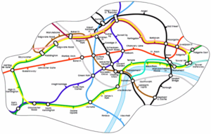
The Tube map is the commonly-used name for the schematic diagram used to represent the lines and stations of the London Underground.
A schematic diagram rather than a map, it does not represent geography but relations; it distorts the positions of the stations considerably. The basic design concepts, especially that of mapping topologically rather than geographically, have been widely adopted for other route maps around the world.

| Contents |
Development
The original map [1] (http://www.tfl.gov.uk/tube/images/company/history/beckmap1.jpg) was designed in 1931 by London Transport employee Harry Beck, who realised that, because the railway ran mostly underground, the actual physical locations of the stations were irrelevant to the traveller wanting to know how to get to one station from another — only the topology of the railway mattered. This approach is similar to electrical circuit diagrams; While this wasn't the inspiration for Beck's diagram, his colleagues pointed out the similarities and he once produced a joke map with the stations replaced with electrical circuit symbols and names with terminology: "bakelite" for "Bakerloo", etc. In fact Beck based his diagram on a similar mapping system for underground sewage systems.
To this end, Beck devised a vastly simplified map, consisting of only named stations, and straight line segments connecting them; lines ran only vertically, horizontally or at 45 degrees.
London Transport were initially sceptical of his proposal — it was an uncommissioned spare-time project — and tentatively introduced it to the public in a small pamphlet. It was immediately popular, and is now used throughout the London Underground on poster-sized maps and pocket journey planners.
Today
The design has become so widely-known that it is now instantly recognizable as representing London; it has featured on t-shirts, postcards and other memorabilia; at least one man has the entire zone 1 map tattooed on his back in full colour, complete with station names (see links below). One of a series of publicity posters for the Underground showed a photograph of the lines of the map squeezed out of tubes of paint: The Tate by Tube, whilst in the Tate Modern itself hangs the artwork The Great Bear by Simon Patterson, a subtle parody of Harry Beck's original design where the station names on a modern map have been replaced by those of famous historical figures.
Several alterations have been made to the concept over the years. In particular, the problem of marking stations with interchange with surface trains was never resolved to Beck's satisfaction. Similarly the colours used to depict each line or operating company have changed over the years. The map was taken out of his hands towards the end of his career. However, recent designs have skilfully incorporated changes to the network, such as the Jubilee Line Extension, while remaining true to Beck's original scheme.
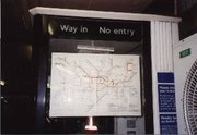
A facsimile of Beck's original design is on display on the southbound platform at his local station, Finchley Central.
Besides getting around London, a tube map is a great help for playing Mornington Crescent.
Further reading
Ken Garland, Mr Beck's Underground Map (Capital Transport, 1994): ISBN 1854141686
External links
- London Underground Tube maps (http://www.tfl.gov.uk/tube/maps/)
- London Underground Tube map history (http://tube.tfl.gov.uk/content/history/map.asp?expandOnly=menu7&sideMenu=menu7option5)
- Interactive historical and geographical tube map of Zone 1 (http://tube.tfl.gov.uk/content/tubemap/realunderground/realunderground.html) (needs Flash)
- H2G2 article on the tube map (http://www.bbc.co.uk/dna/h2g2/A673517)
- The Great Bear (http://www.dareonline.org/artwork/patterson/patterson3.html) by Simon Patterson is an artwork that parodies the tube map
- More on Harry Beck (http://www.designertradingcards.com/harry-beck.htm)
- The London Tube Map Archive (http://www.clarksbury.com/cdl/maps.html) has a collection of Tube maps, showing the growth of the system and the changes in the style of the Underground map
- TfL's suggestion for what the Tube map could look like in 2016 (http://www.tfl.gov.uk/tfl/downloads/pdf/press-releases/putting-transport-onthemap.pdf) (PDF), including trams, tracked buses, and some current overground routes.
- Mapper's Delight (http://owen.massey.net/tubemaps.html) - all kinds of variations and further information on Tube Mapshe:מפת הרכבת התחתית של לונדון

