Pie chart
|
|
- A pie chart is a circular chart divided into segments, illustrating relative magnitudes or frequencies.
In a pie chart, the arc length (and consequently, the central angle and the area) of each segment, is proportional to the quantity it represents. Together, the wedges create a full disk. A chart with one or more wedge separated from the rest of the disk is called an exploded pie chart.
Example
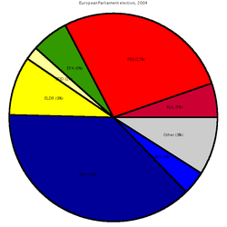
Pie_chart_EP_election_2004_exploded.png
The following example chart is based on the results of the election for the European Parliament in 2004. The following table lists the number of seats allocated to each party group, along with the percentage of the total that they each make up. The values in the last column, is the central angle of each segment, found by multiplying the percentage by 360°.
| Group | Seats | Percent (%) | Central angle (°) |
|---|---|---|---|
| EUL | 39 | 5.3 | 19.2 |
| PES | 200 | 27.3 | 98.4 |
| EFA | 42 | 5.7 | 20.7 |
| EDD | 15 | 2.0 | 7.4 |
| ELDR | 67 | 9.2 | 33.0 |
| EPP | 276 | 37.7 | 135.7 |
| UEN | 27 | 3.7 | 13.3 |
| Other | 66 | 9.0 | 32.5 |
- Comparative Pie Charts
The formula for comparative pie charts is as follows:
number of data in b x radius of a^2/number of data in a
External links
- Draw any pie chart (http://www.algebra.com/calculators/algebra/percentage/pie-charts.mpl)

